
The New England Women’s and Men’s Athletic Conference (NEWMAC for short), of which Clark is a member, is known for its premier academic achievement and competitive athletic contests. One element of NEWMAC that lives in the shadow of athletics and academics is aesthetics. The logo, colors and mascot of a school that are presented on the field (or court) of play say a lot about their identity and how they wish to be perceived by other institutions. Some schools may wish to be seen as clever or academically prestigious based on their choice of mascot, whereas others may want to strike fear in the hearts of their opponent. Today, we are not going to be discussing how good any particular school’s athletics department is; as we begin the 2023-2024 athletics year, the matter at hand for now is each NEWMAC school’s logo. This article was inspired by the Coast Guard Academy’s new logo drop on August 1 – so I will be ranking every NEWMAC school’s logo in its current form.
The Rankings


12) Coming in at the bottom of my ratings, it almost feels unfair to put Mount Holyoke College in this spot. On the NEWMAC website, Mount Holyoke’s athletics logo is simply the primary logo for the institution itself. If one scours the internet for an actual athletics logo, one will come across images of a plain blue paw; however, even if you count Mount Holyoke’s paw logo, that does not save the institution from landing in the basement of these rankings. Mount Holyoke’s lack of a unique sports logo and basic paw places them at the bottom of this hierarchy of emblems.

11) Next in the rankings may come as a surprise to some, but Wheaton College’s right-facing Lyon (spelled Lyon due to Wheaton’s shared founder with MHC, Mary Lyon) has also been puzzling to me. Looking at this logo from a zoomed-out point of view, you cannot tell that the school’s mascot is a lion; instead, one could interpret a whole host of different animals. Zooming in, Wheaton’s logo does not get much better. Its eyes look like those of a cartoon character and the ears make me feel as though I’m looking at a slightly angry dog, not a lyon. I cannot be too hard on Wheaton as they at least have a unique logo, but that is where the positives end for the Lyons.
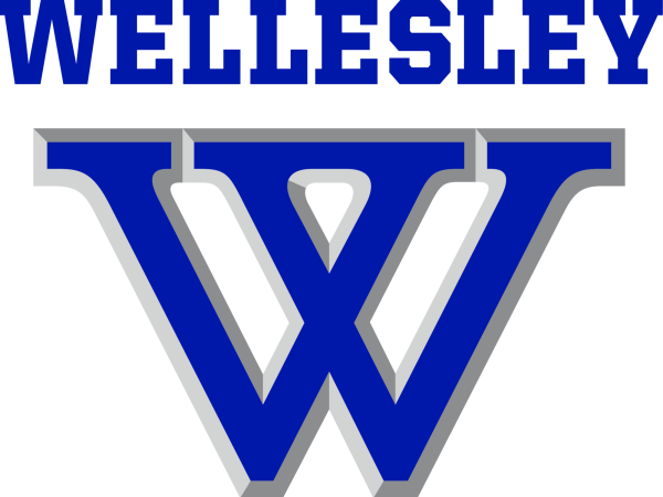
10) Landing at the 10 spot in our rankings, Wellesley College has points docked for the same reason as Mount Holyoke: they do not have a unique sports logo. The Blue’s athletics logo is the same as the overall logo for the college. Fortunately, there are a few small redeeming qualities that keep Wellesley above the bottom two. For starters, though it would be better to have a unique sports logo, at the very least Wellesley can be complimented for having a strong overall design. The deep blue color and square-edged font of the center “W” make Wellesley’s logo appealing to the eye. Beyond these positives, Wellesley still ends up near the bottom because of their lack of creativity.
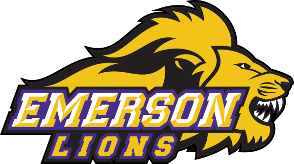
9) Returning to schools that actually have a separate logo for athletics, Emerson College falls into the nine spot. The main reason why the Emerson Lions place so low in this list is due to the lion itself; though I can identify this animal as a lion (looking at you, Wheaton…) I personally do not enjoy the look of it. The primary areas of offense for Emerson are the eyes and mouth of the lion, both looking out of place and generic. The disappointing part of Emerson’s logo is the amount of potential it holds, as the rest of the logo beyond the eyes and mouth are solid. Emerson has a superior color combination of yellow and purple, and the mane of the Lion flows nicely with the rest of the logo. With some small changes to the eyes and mouth of Emerson’s lion, they could have a top-tier logo.
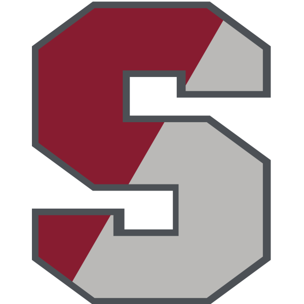
8 & 7) Above Emerson in my rankings we have what I like to call the “S tier,” though, unlike traditional tier lists, my S tier does not denote the best. My S tier includes two schools: Springfield College and Smith College. Both Smith and Springfield simply have the letter “S” stylized to each school’s liking for their logo. The S logos are neither horrible nor great as they both are just a single letter at the end of the day. Springfield’s logo is a classic. With the block lettering and dual red-gray color scheme, it is a simple yet effective logo.

Smith’s plain curvy S is less interesting to me in terms of shape when compared to Springfield; however, the Pioneers make up for it with an outstanding palette of colors. The thin yellow stripe in Smith’s logo is what pushed their color scheme a notch above Springfield’s. In the end, a combination of Springfield’s block lettering and Smith’s enticing colors would create the ultimate S logo.
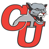
6) Though I wish I could place this logo higher due to my obvious personal bias, it would be unfair. Clark University slots in at the middle of this list. As a big fan of Clark Athletics, of course, I enjoy Clark’s logo. Despite this, I will admit that our logo is far from perfect. The biggest defect of Clark’s design is the cougar itself. Clark’s cougar looks odd, being a floating disembodied head attached to a nondescript body in the background. As for the rest of the logo, I believe the other aspects are quite appealing. The red highlights along the side of the cougar’s face are a nice touch of detail and the large “CU” conveys its message in a clean manner. Overall, Clark falls in the middle of the rankings for being a proficient but average logo with one sizable downside. If you want to see the best of what Clark has to offer when it comes to logos, check out the E-sports team, as their logo has exactly what the varsity athletics logo is missing.
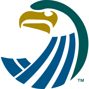
5) As we move towards the top of our list, we start to approach some of the finer logos within the NEWMAC. Next in my ranking is a newcomer in the NEWMAC: Salve Regina University. For the new kid on the block, Salve comes in strong at the fifth spot. Highlights of the Seahawks’ logo include its color scheme and unique use of negative space. Much of Salve’s design is composed of negative space, allowing the viewer to fill in the blanks with their own imagination. Unfortunately, the biggest weakness of the seahawk is the lack of detail. Overall, though, Salve’s entry to the NEWMAC has added a unique, slightly abstract and clean logo to the conference’s lineup.
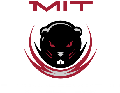
4) Moving beyond NEWMAC’s newcomer, the Massachusetts Institute of Technology (MIT) opens up the top third of my rankings. The top four NEWMAC logos are in a league of their own when compared to those below them, and there’s no better way to show that than through MIT’s logo. The Beaver logo does just about everything right: eye-dazzling colors, creative usage of lines to portray movement, a sleek beaver and a perfect lettering choice that just screams “MIT” to boot. I have no major complaints here – but for those interested, I think that MIT’s club sports logo may be even better than their varsity logo.
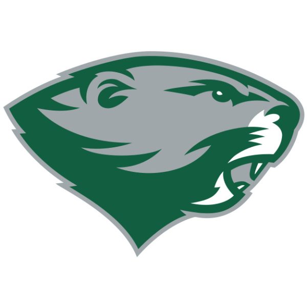
3) Cracking the top three, Babson College is up next in the rankings. Much like the previous beaver, I have no complaints when it comes to this design. Babson’s Beaver is clean: with a forest green base, gray detailing and white accents, the color pattern is exactly what it should be for nature’s engineers. Babson’s logo is simple, but in the best of ways. Over-the-top detailing or extra lettering is not needed when you have a strong logo that tells you exactly what you need to know succinctly. Though Babson’s current logo has only been around since 2016, it feels like a timeless classic that could’ve been crafted during the college’s founding.
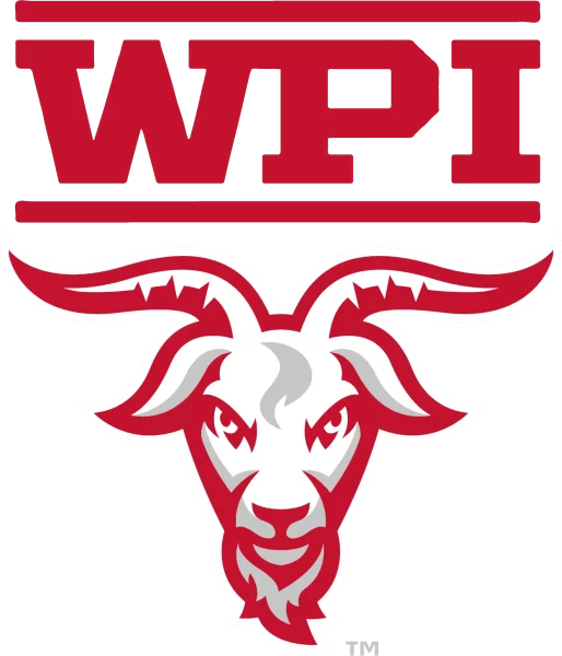
2) Coming in at the penultimate spot in my ranking is Clark’s crosstown rival, Worcester Polytechnic Institute (WPI). They do everything right. WPI’s design sticks to an emerging pattern for success: great color choices, and an animal design done right. The WPI Goat feels ageless, and its intimidating stare offers a warning to any opposing teams. The horns of the goat, alongside the lettering, are what launched WPI to second place in my rankings. The bold block lettering used is perfect for an engineering-focused school, and the solid red lines above and below are another layer that adds to the boldness of this logo. Finally, how the horns of the goat underscore the “WPI” above is a perfect finishing touch.
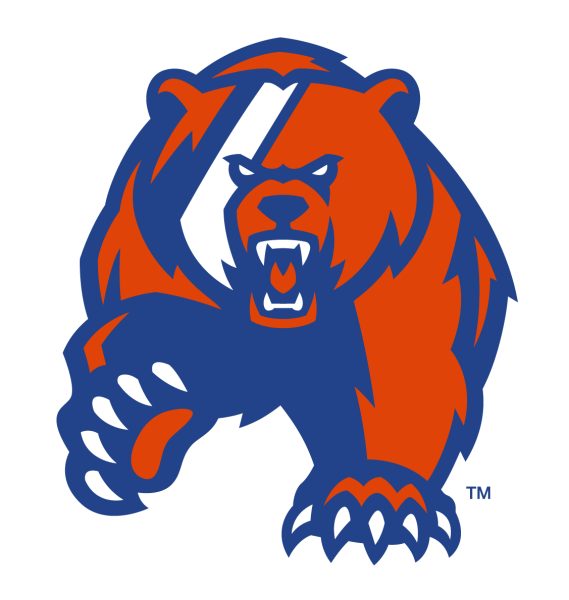
1) Our winner is none other than the inspiration for this article, the U.S. Coast Guard Academy (CGA). The complete shakeup in Coast Guard’s branding is nothing short of amazing, thanks to the design team down in New London. The Academy’s old logo would have placed very near the bottom of the list; the new design is unrivaled. The Coast Guard bear is striking, looking directly at you with its piercing white eyes while extending a paw with outstretched claws. This is exactly what an animal mascot should look like. With this being said, the real reason I placed CGA’s logo at the top is for its use of color – chef’s kiss. A primarily orange bear with deep blue shadows and a fierce white racing stripe across the face catches your eye like no other NEWMAC logo can. The usage of Coast Guard livery on this bear is simply marvelous. I hope CGA’s conference peers (cough cough Clark, Emerson and Wheaton) take as much notice as I have of this much-improved design.
wellesley super fan ~ Sep 9, 2023 at 11:02 am
respect the W